How we achieved a white yet dynamic facade for Aiete Health Centre
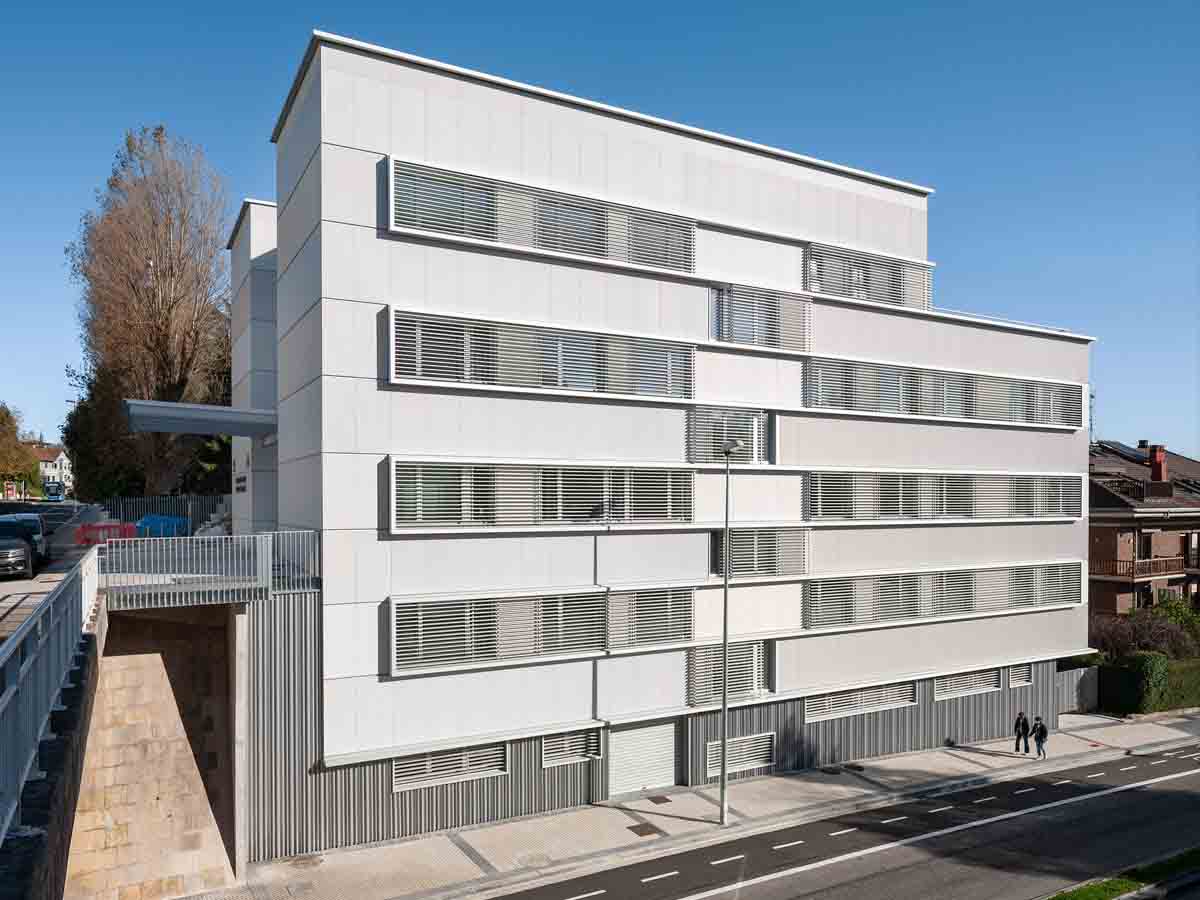
Combining different textures, formats and joints can conjure up many options: discover them.
White represents: absolute clarity, absence of darkness, and the sum of all colours.
But it is more than just technically white, as we need to take into account the impact it has on the human mind.
White is normally associated with concepts such as: purity, peace, cleanliness, innocence... That is why it is used extensively in the health field, to make people feel reassured.
We can all agree on that. If we picture a health centre or hospital, our mind comes up with an image of a sleek white building.
However, while logic tells us that a health centre should be white, we can still do it differently, and give the building personality.
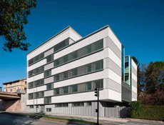
This is what happened at Aiete Health Centre, Donostia-San Sebastián (Basque Country).
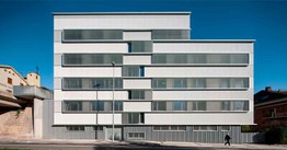
It may be a white building, but it is one with personality, life, movement and dynamism.
Here we will show you how this has been achieved by combining a range of elements.
Which elements can we play around with and combine in order to find the aesthetic composition we are looking for?
- The Texture of the panel
- The Format
- The Joints
SATIE Architects studio, which oversaw both definition and design, has achieved the desired result by successfully combining these elements in the ventilated facade, creating the image of health and transparency required of such a facility.
Texture: The dynamism the WATER mini-wave texture offers us
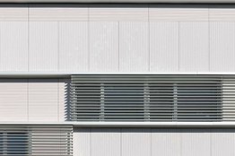
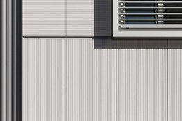
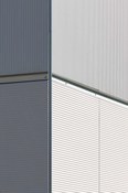
To start with, WATER texture was chosen in this case playing with two different orientations: vertical and horizontal.
This texture combination allowed us to visually create large areas on the building's facade with subtle shade differences. The same colour, white M24, was chosen for all the panels, although the tone darkens somewhat depending on the orientation of the panel's wave, giving the sensation of having two colours. The horizontal orientation tends toward a more greyish tone.
Orientations can also be diagonal (right or left).
It is important for the architect to have a variety of finishes to choose from. And we bear this very much in mind.
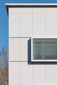
The panel format makes it easy to achieve a horizontal effect.
The large panel format (1800 x 900 mm) helps achieve the
linear and horizontal effect that SATIE studio was looking for in the project, despite using the Vertical installation system.
Joints are our allies when it comes to emphasising or disguising.
There are projects in which we are not interested in emphasising the joints, while in others we seek to enhance them to achieve a particular effect. This is a key element in obtaining a unique, standout aesthetic.
Not long ago we talked about a project in which this type of joint had been used to give the facade verticality.
In this case, the aim was to give the sensation of large formats, horizontality and linearity.
50 mm joints have been installed to help to highlight this horizontality and diminish the smaller joints so they go unnoticed.
Combining the texture, joint, format and vertical installation system therefore achieved a modern, dynamic facade with great personality.
Joints are versatile elements, and we have options ranging from the 3 mm joint, the smallest on the market, when looking for a consistent, clean, flat facade.
The 8 mm joint can be used to stand out, differentiate or separate by shades.
There are also the 15 mm, 20 mm and 50 mm joints. These sizes are used when looking to frame areas or define a style, either horizontally or vertically.
We spoke to Ekain Olaizola, part of the team of architects in charge of the project, who pointed out that "choosing this material meant the building's different volumes could be understood as specific units, overcoming the problem of continuity of cladding on corners and roofs. This material guarantees great durability and minimum maintenance with a multitude of formats and textures". These are important factors that are often put to great effect by project managers, as made possible with our material.
Apart from choosing the Ventilated Facade system, which is key to creating an energy-efficient building, the team has included a range of elements to ensure sustainability, such as: slats for solar protection on the most exposed facades, or window frames with thermal break and triple glazing, cross ventilation for thermal control and air renewal, as well as efficient installations such as aerothermal energy for underfloor heating and heat recovery.
If you would like to know more about this or any other architectural solution, please do not hesitate to contact us.
The team at SATIE Architects is very much committed to sustainable construction. As Ekain explains, this not only implies choosing efficient construction systems, but also ensuring that the building is correctly orientated, adapted to the land, does not leave adjacent buildings in the shade, that the construction materials can be recycled, etc.
At ULMA we like to offer different alternatives to play around with, giving the designer the opportunity to create unique buildings, something made possible by combining these options.
Because we are all different, and we like our projects to be different too.
TECHNICAL DETAILS:
HEALTH CENTRE-AIETE- Donostia-San Sebastián
DEVELOPER: OSAKIDETZA
BUILDER: EBA
ARCHITECTS: SATIE Architects
- Enrique Muga
- Joseba Fernández Beldarrain
- Beatriz Bergasa
- Ekain Olaizola
- TECHNICAL ARCH.: Leire Badiola
SURFACE AREA: 1500 M2
FORMAT: 1800X900 mm
TEXTURE: STONEO LOOK - WATER. HORIZONTAL AND VERTICAL
COLOUR: WHITE M24
JOINT: 50 mm
LOCATION: Aiete. Donostia-San Sebastián, Gipuzkoa
