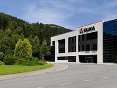
The new skin of ULMA Architectural Solutions
The construction of the plant coincided with the launch of the new business line of Ventilated Facades, a new construction system that was beginning to take hold in Europe given its sustainability and energy saving capacity.
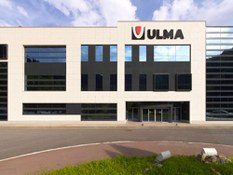
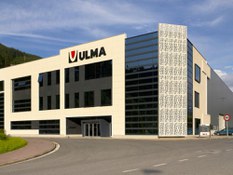
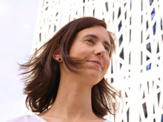
Among the milestones planned to mark the 25th anniversary of the cooperative (1990-2015), it was decided to tackle the project of the facade renovation. A multidisciplinary team was created which worked on maintaining the essence of the project while adapting to new architectural trends and new developments in the line of ventilated facades. It was decided that the responsibility for the development would rest with internal staff, with the architect of the technical team from facades, Jaione Vazquez, responsible for designing the new enclosure.
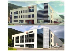
ORIGINAL BUILDING
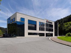
It was a contemporary and modern design where the "horizontality" of the building and the curtain wall had been the protagonists of an innovative building for its day. Another of the most peculiar elements was the fact that the facade on encountering the industrial building symbolically hugged it, making a subtle transition. Finally, noteworthy was the integration of polymer concrete in the curtain wall marking out horizontal lines that crossed the glass skin of the building from side to side.
NEW PROPOSAL INSPIRED BY ORGANIC TEXTURES
What was being aimed for with this update / renewal?
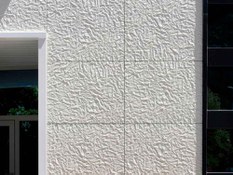
The first intention was to convey with this new facade a more organic feel through the textures, shapes and chosen colour, both bringing it up to date with the present architectural moment and the possibilities offered by our polymer concrete.
Over the years we have been developing and improving our material and we have tried to emphasize the customization possibilities we offer. Likewise, since it is a renovation, it was important to show the versatility provided both by the construction system and by the material for the re-composition of existing gaps, since one of the clearest premises was the need to maintain the original support structure. We also wanted to highlight the entrance module, emphasize the volume of the existing gaps framing them within the black graphite and that the ULMA Logo would become more prominent.
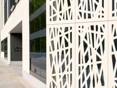
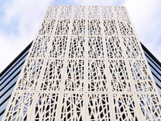
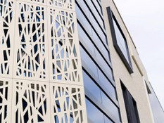
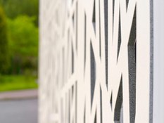
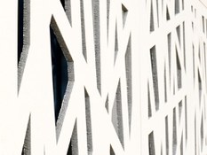
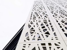
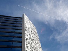
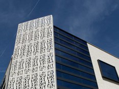
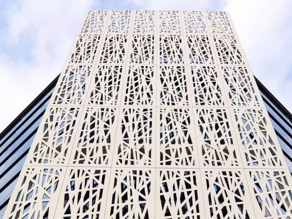
Another notable aspect of the new development has been the placement of a double skin on the curtain wall to protect this southwest facing area of the building from solar radiation. A lattice has been placed which becomes the creative element and protagonist of the entire facade, helping to filter the light as well as providing a very innovative style to the facade.
As mentioned above, we have maintained the primary structure of the Ventilated Facade improving the thermal envelope by placing additional thermal insulation, which provides clearly perceptible significant energy savings and increased comfort.
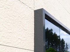
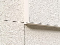
The textures chosen were "paper" in a light colour that simulates organic cotton and "sandpaper" texture (black coal) for the main zone. The lattice has a design in line with the texture of paper; a bamboo plantation which is enhanced with night lighting. Finally, noteworthy is the fact that the renovation was carried out in two months and working exclusively from the outside of the building. In our Youtube channel you can see the change of the facade.
Here are just some of the different opinions on this new change.
Opinion of ULMA Architectural Solutions partners:
It was a necessary change, and what better milestone for it than our 25th anniversary. This change of "face" in addition to the aesthetic component is a true reflection of the continuing evolution that our company has undergone since its inception and due largely to the efforts and involvement of the people who make up Ulma Architectural Solutions. The change of face is also a sure sign of fresh air and a message of optimism / eagerness as regards the project that we share. Unai Arregi: President ULMA AS
Our new facade is simple, striking and with an innovative twist, but needless to say, without taking any merit from the original facade we manufactured in the Precast line and has been with us over the last 15 years. In my opinion, we the manufacturers could have shown more of the possibilities offered by our material and our system. But ultimately it is a good new look thanks to the good work done by all who have made this project a reality. Congratulations!! Alfonso Cueva: ULMA MANUFACTURING AS
Of course we could have risked more, more colour, more daring ... but I think if we had brought the facade bang up to date, it would have been more ephemeral. We must not forget that we are an industrial company, and we must find the right balance between simplicity and daring creativity to show our capabilities. What I am convinced of is that as the first company in the Group with which the visitor comes face to face, the image that we convey is of the highest level. Irene Moreno. Head of Communication. ULMA AS
Opinions from around the company:
1. Substantial improvement in terms of image.
2. An excellent idea to consider a brand protection area and give it more space and make it bigger.
3. The facade mood is simple yet elegant with the contrasting black of the windows. Carlos Sarabia. Brand Coordinator
I liked the crumpled paper relief effect on the new facade. The lattice breaks the general line a little and gives it a more modern effect. I like that it aligns with the top edge of the facade above the logo. I also like that you have added many dark facade areas giving the impression that there are huge windows. Joseba Alberdi. ULMA Packaging
The new facade reflects modernity, elegance, cleanliness, innovation, combined with an artistic touch... and I think this is an image to associate with and benefit the ULMA brand. A nice way to lead by example. Nerea Zallo. ULMA Construcción
The improvement of the facade image is remarkable. Personally I really like the final result; it combines elegance and simplicity in addition to being a powerful showcase for ULMA Architectural and the finest form of endorsement when visitors come to Oñati and / or other ULMAs. Edurne Unzueta. ULMA Handling Systems.
Opinion of architects:
The new facade of the ULMA Architectural Solutions factory shows that the proper choice of colours, shapes and textures from the ULMA product range ensures two fundamental aspects of an architectural project: the simplicity of elegance and the elegance of simplicity. The versatility of textures and the possibility of lattices allow us to solve different design and environment requirements and with the same material requirements, reducing solar radiation as needed. José Aguilar, Architect of the Architecture Studio agvar - Aguilar y Varona Arquitectos.
